
Graphical Visualizations in R Graphical Visualizations in R Visualizing the dаta not only helps us in aesthetically pleasing graphs but also will help in drawing business insights, which will shape the organizations & help them be competitive in the market. Let us have a look at a few charts using R, which we would be using in our daily work. Let us also look at what can be inferred from the dаta. Histogram Bar Plot Box plot Scatter Plot Pie Chart Correlogram Hexbin Plots Mosaic Plots Table Plots Missingness map Heat maps Additional Visualizations Histogram:
Graphical Visualizations in R
Visualixing the dаta not only helps us in aesthetically pleasing graphs but also will help in drawing business insights, which will shape the prganizations & help them be competitive in the market.
Let us have a look at a few charts using R, which we would be using in our daily work.
Let us also look at what can be inferred from the dаta.
- Histogram
- Bar Plot
- Box plot
- Scatter Plot
- Pie Chart
- Correlogram
- Hexbin Plots
- Mosaic Plots
- Table Plots
- Missingness map
- Heat maps
- Additional Visualizations
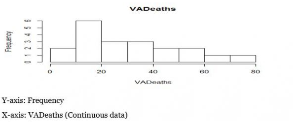
Histogram
Histogram plot explains the frequency distribution of a set of continuous dаta.
It breaks the dаta into bins and shows the frequency distribution of these bins.
Interesting things about histogram that we can inder are:
- Normal distribution
- Skewness
- Outliers
- Kurtosis
R Code
> dаta(VADeaths)
>hist(VADeaths)
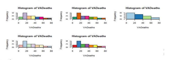
Coloured Histogram:
>install.packages(“RcolorBrewer”)
>library(RcolorBrewer)
>help(brewer.pal) #Creates colored bins
>par(mfrow=c(3,3))
>hist(VAdeaths,breaks=8, col=brewer.pal(10,”Accent”))
>hist(VAdeaths,breaks=5, col=brewer.pal(6,”Dark2”))
>hist(VAdeaths,breaks=3, col=brewer.pal(3,”Paired”))
>hist(VAdeaths,breaks=6, col=brewer.pal(6,”Pastel1”))
>hist(VAdeaths,breaks=8, col=brewer.pal(10,”Set1”))
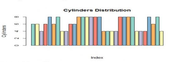
Bar Plot:
Bar plot helps us in comparing cumulative totals across different variables.
Bar plot for single variable is a plot between magnitude of variables and its index
Bar Plot for Single Variable:
For Continuous dаta, bar plots simply show rectangular bars( length of each bar represents the magnitude of the variable).
>dаta(mtcars)
>barplot(mtcars&cyl,cor=brewer.pal(6,”set3”), xlab= “Index”,
ylab=”Cylinders, main=Cylinderdistribution)
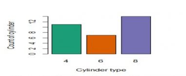
For categorical type of dаta
>table(mtcars&cyl)
MTcars$cyl
4 6 8
11 7 14
>barplot(table(mtcars$cyl),col=brewer.pal(3,”Dark2”),
names.arg=c(“4”,”6”,”8”),xl ab=”cylinder type”, ylab=”count of cylinder”)
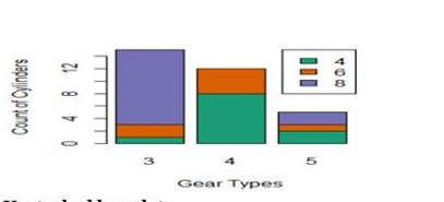
2 different visualizations with bar plots( For Comparing the cumulative totals across different variables)
Stacked bar Plot
>barplot(table(cyl,gear),names.arg=c(“3”,”4”,”5”),xlab=”GearType”,
ylab=”Count of Cylinders”,
col=brewer.pal(3,”Dark2”);legend(“topright”,c(“4”,”6”,”8”),
fill=brewer.pal(3,”Dark2”),cex=1)
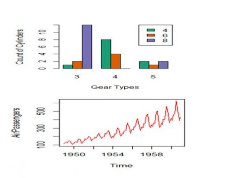
Unstacked Barplot
>barplot(table(cyl,gear),names.arg=c(“3”,”4”,”5”),xlab=”GearType”,
ylab=”Count of Cylinders”,
col=brewer.pal(3,”Dark2”),beside=T);legend(“topright”,c(“4”,”6”,”8”),
fill=brewer.pal(3,”Dark2”),cex=1)
Box Plot
Box plot is used for visualizing the spread of dаta and to detect outliers if any, it is also useful to know if dаta is skewed or not.
When a box plot is plotted, the below mentioned five statistical values are displayed
-Minimum
-1st quartile(median of 1st 50% of dаta)
-Median line
-3rd quartile(median of last 50% of dаta)
-Maximum
InterQuartile Range(IQR) is the spread of the dаta that is present inside the rectangular box of box plot
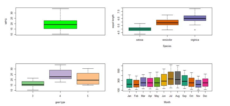
Box plot visualization:
>dаta()
>libraries(dаtasets)
>dаta(mtcars)
>dаta(Airpassengers)
>dаta(iris)
>par(mfrow=c(2,2)
>boxplot(mtcars$mpg,col=”green”, ylab=”MPG”)
>boxplot(iris$Sepal.Length ~ iris$Species,col=brewer.pal(9,”Dark2”,
xlab=”Species”, ylab=”sepal length”)
>boxplot(mtcars$mpg ~ mtcars$gear,col=brewer.pal(4,”Accent”,xlab=”GearType")
>bloxplot(AirPassengers~cycle(Airpassengers),col=brewer.pal(12,”Dark2”),
xlab=”Month”, names=c( “Jan”, “feb”, “Mar, “April”, “Jun”, July, Aug”,
“Sep”, “Oct”, “Nov”, “Dec”)
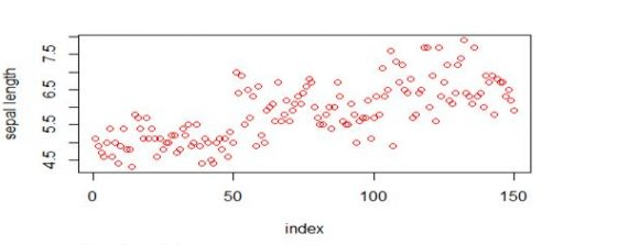
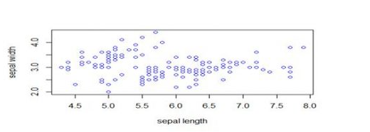
Scatter Plot:
For Single Variable, it is a visualization, which is very simple and it talks about the spread of dаta
If the scatter plot is plotted between 2 variables then it shows the correlation between those 2 variables.
Scatter plot for a single variable
>plot(iris$Sepal.Lenghth,xlab = “index”, ylab=”sepal length”, col=”red”,
type=”o”)
Scatter plot for 2 variables
>plot(iris$Sepal.Lenghth, iris$Sepal.Width,xlab=”sepal length”,
ylab=”sepal Width”, col=”blue”, type=”p”)
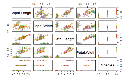
Scatter plot matrix will help visualize the variables each other
>Plot(iris,col=brewer.par(10,”Dark2”))
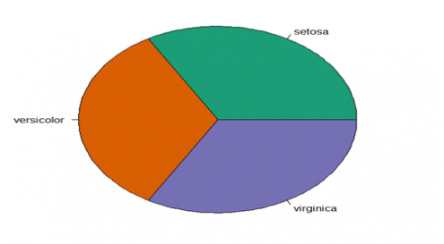
Pie chart
>pie(table(iris$Species),col=brewer.pal(3,”Dark2”))
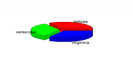
3D pie chart
>install.packages(“plotrix”)
>library(plotrix)
>pie3D(table(iris$Species),labels=c(“setosa”, “versicolor”,
virginica”),explode=0.2)
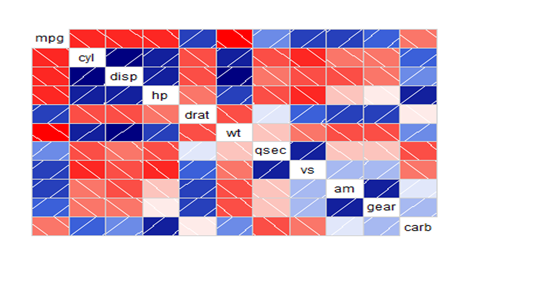
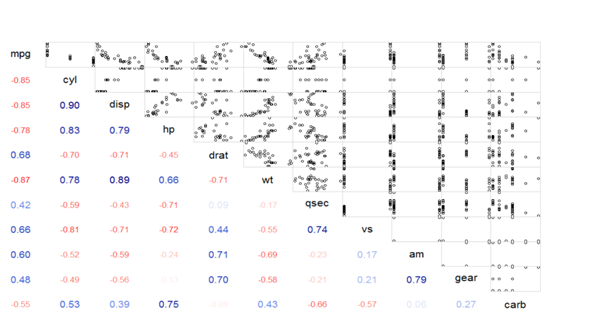
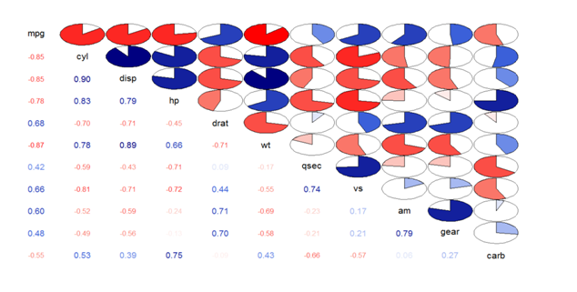
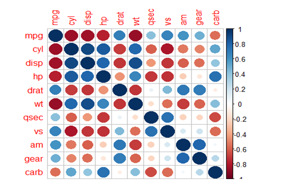
Correlogram:
These are used to test the level of correlation among the variables present in the dаtaset.
The cells of the correlogram are shaded or colored to show the correlation value.
Darker the color, higher is the correlation between the variables.
>dаta(mtcars)
>install.packages(“corrgram”)
>library(corrgram)
#Normal Correlogram Plot
>corrgram(mtcars)
#Correlogram with scatter plot between variables
>corrgram(mtcars,lower.panel=panel.cor,upper.panel=panel.pts)
#Correlogram with correlation values and pie plot
>corrgram(mtcars,lower.panel=panel.pie,upper.panel=panel.pts)
#Correlation and correlogram plot
>install.packages(“corrplot”)
>library(corrplot)
Cor_matrix<-corr(mtcars) #Correlation values between variables
>corrplot(cor_matrix) #Normal Correlation correlogram plot
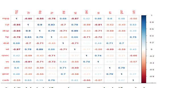
#Specialized the insignificant values according to significance level
>corrplot(cor_matrix,type=”lower”, addCoef.col=”black”,method=”color”,
col=brewer.pal(5,”set2”))
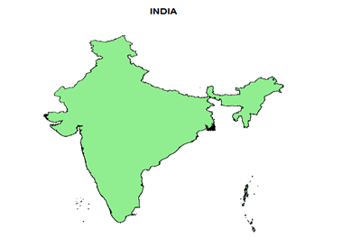
#level=>level of administrative sub division (0 or 1 or 2)
>plot(c_ind_o,col=”lightgreen”, main=”INDIA”)
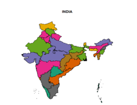
#To Display States
>library(RcolorBrewer)
>c_ind_1<-getDаta(“GADM”, country=”IND”, level=1)
>plot(c_ind_1,col=brewer.pal(12,”Dark2”),main=”INDIA”)
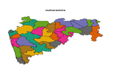
>c_ind_2<-getDаta(“GADM”,country= “IND”,level=2)
>c_ind_2_maharasthra<- subset(c_ind_2,c_ind_2$Name_1== “Maharashtra”)
>plot(c_ind_2_maharasthra,col=brewer.pal(12,”Dark2”))
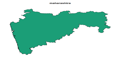
>c_ind_1<-getDаta(“GADM”,country=”IND”,level=1)
>c_ind_1_maharasthra<- subset(c_ind_1,c_ind_1$Name_1==”Maharashtra”)
>plot(c_ind_1_maharasthra,col=brewer.pal(12, “Dark2”))
#World Climate
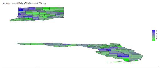
#To get the unemployment rate of statesIndiana and Florida
Unemployment_Indiana_Florida<-
get_bls_county(statename=c(“Indiana”,”Florida))
>bls_map_county(map_dаta=df,fill_rate = “unemployed_rate”,labtitle = “unemployment Rate in Indiana”,highFill = “blue”,lowFill = “green”,stateName = c(“Indiana” , “Florida”))
# To display correlation coefficient between any 2 variables
>corrplot(cor_matrix,method= “number”)


.svg)